read
In this article, we will discuss how you can use the formerly known Google Data Studio, now Looker Studio effectively to visualize data in a bar chart, graphs, and reports.
Data analysis and data science are driving changes in the way businesses use their data. This is especially true for marketing. Businesses are looking at a wide variety of dimensions and metrics to try to find the next competitive advantage. Visualizing data makes it easier to take in all this information and see what is working.
The real value of this is not the latest bar charts or pretty pictures. Here is an elegant summary:
“In the end, the analytics won't tell you the next big creative idea. It will tell you when the next big creative idea is working. - Elea Feit, Assistant Professor of Marketing, Drexel University
Why is data visualization important?
Easy to follow reports, pie charts, graphs, images, and visualizations are all important because they help users interact with data. A single bar chart can communicate more about your business data in an instant than a few paragraphs of text. Data scientists and businesses are learning how to analyze data and then visualize it to identify trends and communicate key information.
As an example, think of the data visualization that happened during the Covid-19 pandemic. Every day, someone on the news team would create charts that either calmed or inflamed tensions around the world.
Businesses have always used data visually, but now there are more tools to explore and more ways to display data than ever before.
Top data visualization tools
Tableau
Tableau is another popular tool for data visualization. Tableau uses AI and Machine Learning to connect to multiple data sources. It also features a connection to Salesforce CRM. Key features include intuitive use and automated data prep to derive cleaner data faster.
Power BI from Microsoft
Microsoft Power BI is a business intelligence tool used by hundreds of thousands of businesses. It is recognised as the industry leader by Gartner, a key business analyst. Microsoft Power BI is especially useful for businesses that make use of the entire suite of Microsoft products, including Excel and Access.
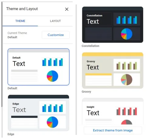
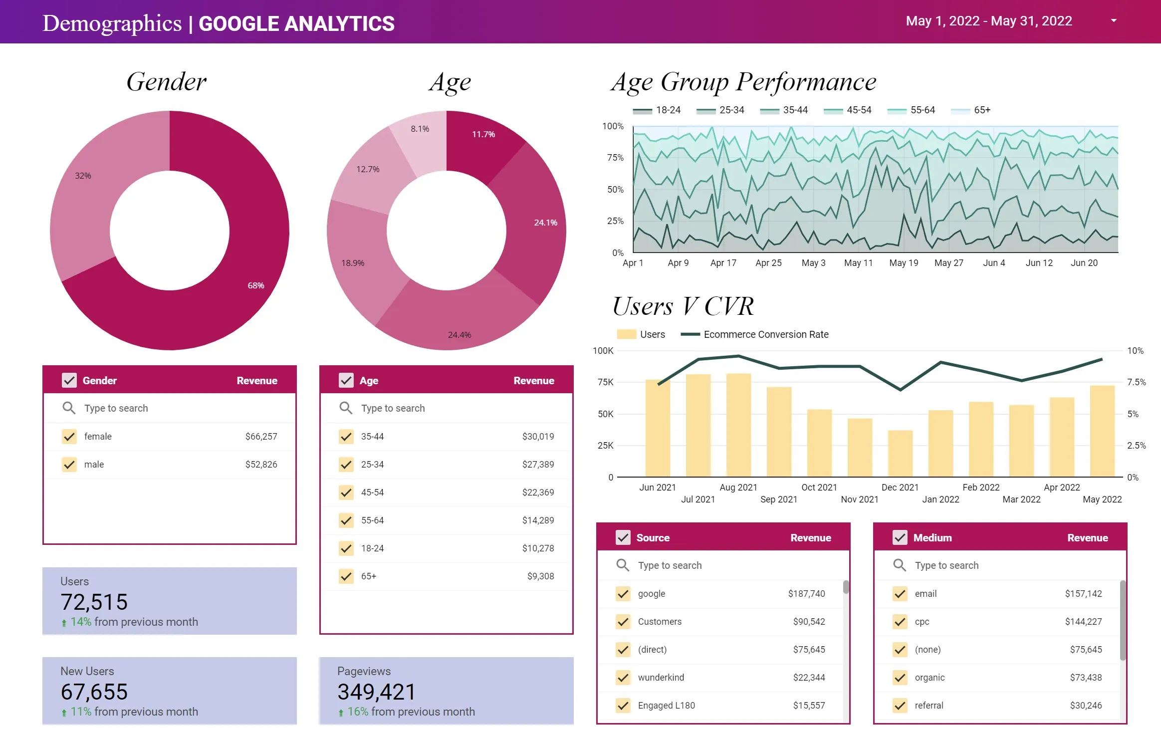
Google Data Studio
GDS is a free tool created and published by Google to convert data into customisable reports, charts, and graphs so people can see the data clearly. GDS is especially useful for Google Analytics data and connects to this source easily.
Prime Benefits of Google Data Studio
GDS is a powerful tool for bringing your data to life. Creating a visual display of data helps viewers explore what is happening in their business, website, or social media channel.
Let’s take a look at some of the key benefits of GDS for its users.
Dynamic dashboards visualise data from any data source
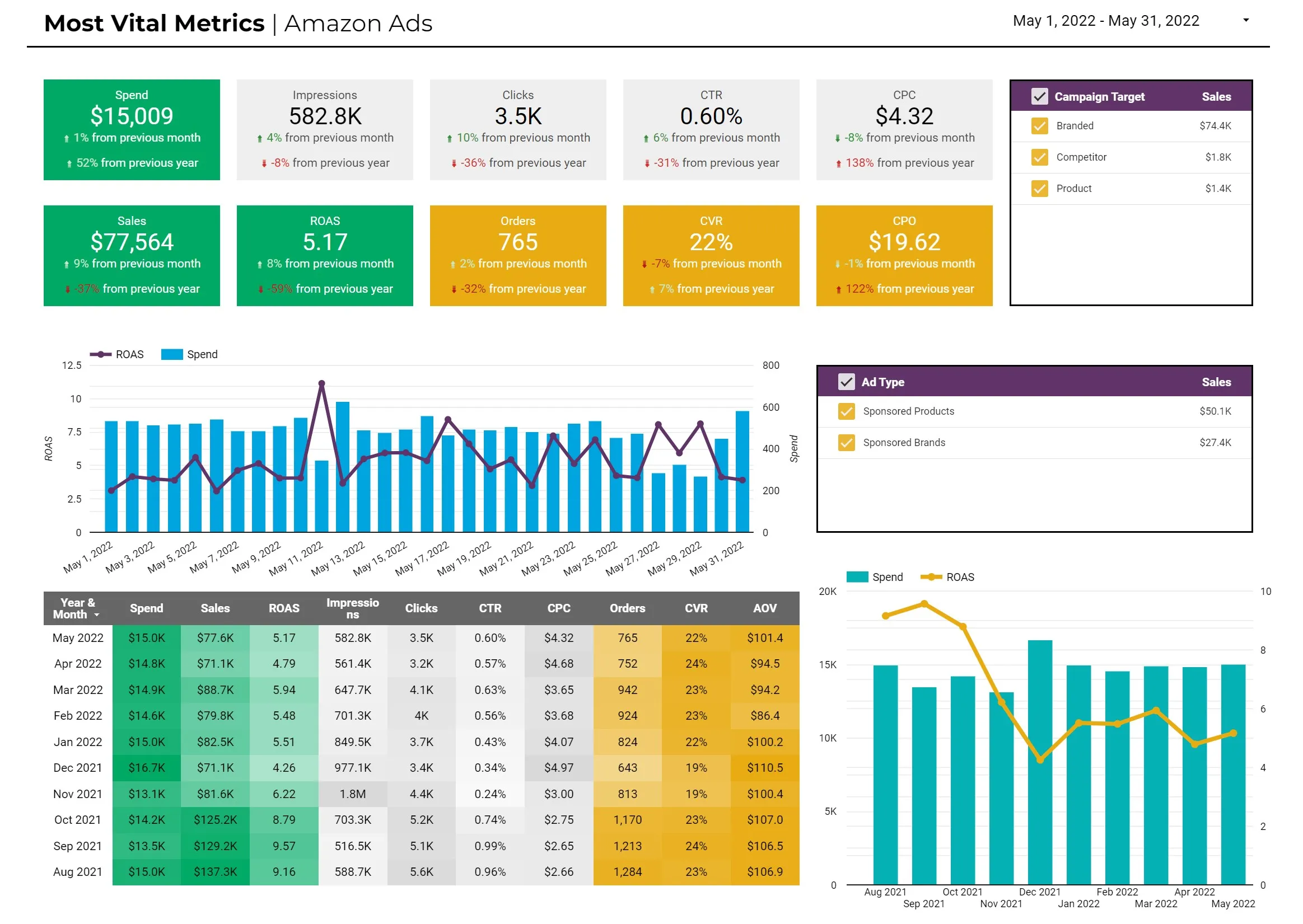
Dynamic dashboards are GDS's most powerful feature. You can use GDS to combine multiple datasets and visualise them all on the same dashboard, or you can create a custom report with only one dataset in it.
Static reporting tools don't work as well because they capture snapshots of limited data sets. With GDS, you can capture any point in time and show it using dashboards for data visualization. This displays all the relevant information about that moment, including how things have changed.
This is because GDS has access to more than just one dataset: it lets you combine multiple datasets from different data sources.
Let's break down five brilliant advantages of a dynamic dashboard before we turn to look at how to get the most out of GDS.
Easy Shareability Promotes Teamwork and Transparency

A massive bonus from Google Data Studio (now called Looker Studio) is the ability to share reports and dashboards very easily. You can share any asset, such as a dashboard or report. Other people can access your shared asset as an editor or viewer.
This easy shareability helps promote teamwork and transparency. Your team can share assets to track just about anything and keep everyone on the same page. Your clients will appreciate access to different content types and metrics.
Now that we've covered the reasons why you really should be using GDS for your data visualization, let's dig into four solutions for giving more power to your teammates and information to your customers.
Use real-time reporting to build trust and transparency
Marketers and businesses rely on data to make excellent decisions. The insights from data give them the information they need to do things like improve customer experience, make better business decisions and meet organisational goals.
But there are a lot of pitfalls with interpreting data that lead many businesses to distrust what they're seeing in their dashboards, reports, or other analytics tools.
A dynamic dashboard can help ease this problem because it updates in real time. Fresh data that can be interacted with, filtered, or updated, works better. It gives decision-makers more confidence in their options.
Claim Your Free Audit to Uncover Hidden Opportunities
Key features of Google Data Studio (GDS)
Google Data Studio is a free tool you can use to visualise your marketing data. You can use multiple data sources in GDS, and each visualization can have its own custom settings.
GDS is great for internal use to track metrics or KPIs in your company, but it's also a great tool if you want to create reports for customers that are more interactive and dynamic than traditional reporting tools offer.
GDS has significant advantages for you as a marketer and a business. We'll cover the main advantages and then show you four key ways to get the most out of your data visualization.
Let's get into it.
Interactive fields allow you and customers to access better data
Interactive fields are fields that are embedded in a table and allow the user to filter data by clicking on specific cells. They can set the state of these interactive fields according to the needs of users as they navigate through your dashboard or report. Therefore, this type of field can help you meet organisational goals and improve customer experience.
An example of an interactive field is a date range field. You or a customer can decide which dates are important and then look up that data.
Data studio templates save time and money
Templates for GDS save time and money.
The templates for GDS are easy to use because you can make your own reports or dashboards with pre-built formatting, widgets, queries, and charts. Once you create a data template, you can update it anytime to include new info and data visualizations. You can also use it on multiple projects and for different clients.
There is no need to start from scratch when it comes to creating a dashboard or report in GDS. There are many templates available online. Here is a link to one site with over 50 templates you can access: 50+ FREE Data Studio Templates to Automate reports
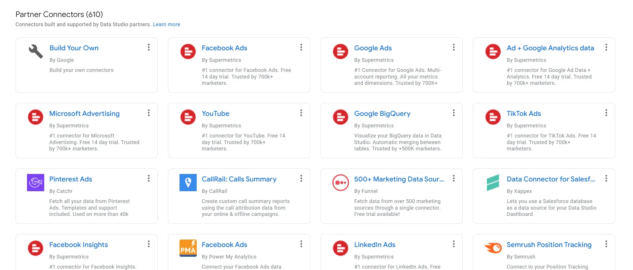
Data Connectors Add Functionality
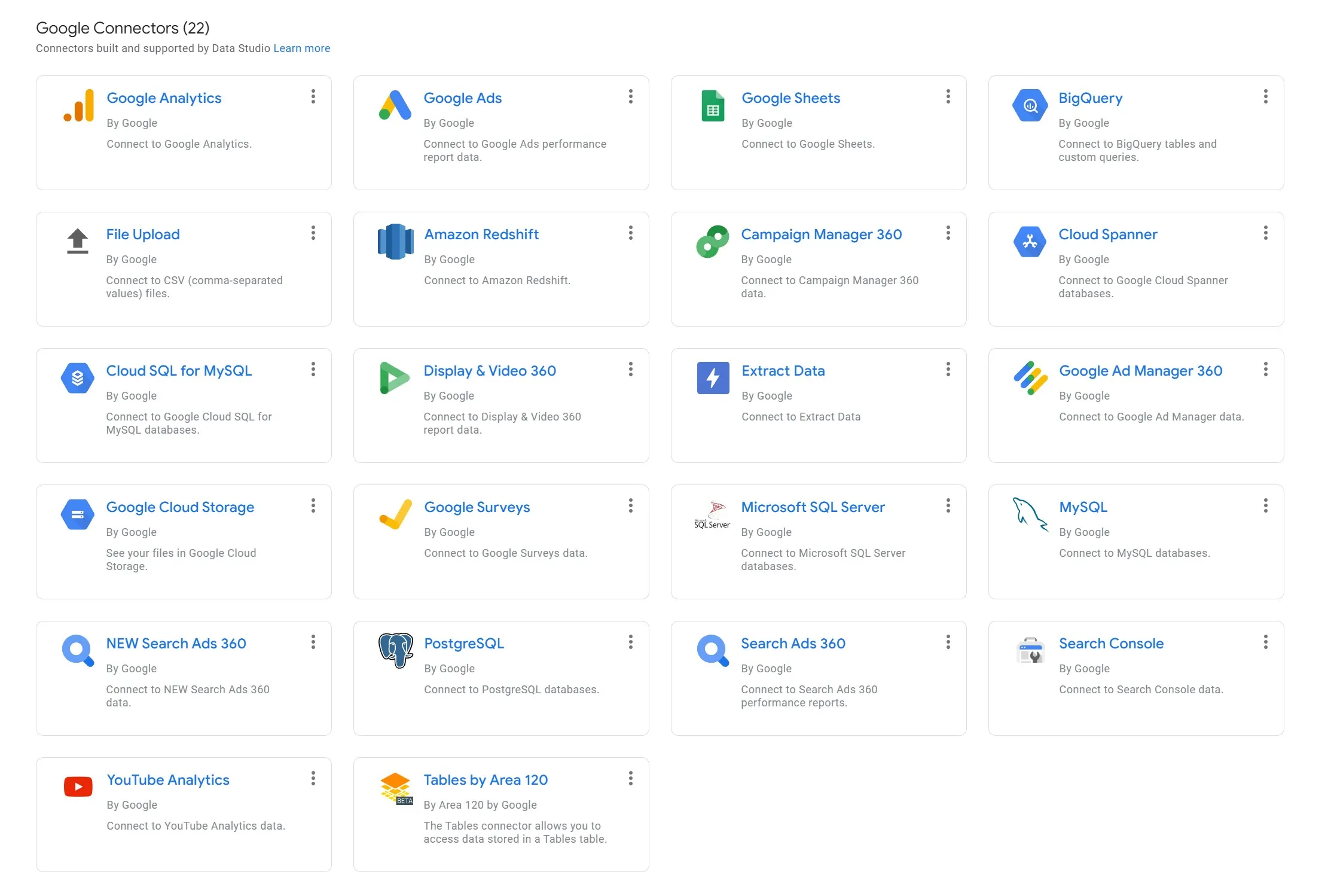
A connector is an app that lets you import from any data source into Google Data Studio. Using this, you can connect information from more than 300 different data sources.
Google Analytics is probably the most significant example of a data connection. There are three main Data Connectors for Google services:
Connect to Google Analytics to bring your website data into GDS as a data source. You’ll be able to focus on a single metric or create a data studio report for a broader selection of your work.
Connect to Google Search Console to focus on organic search traffic as a data source. You’ll be able to create much more sophisticated charts for tracking organic search traffic and results.
Connect to Google Ads to build clearer reporting with your ad campaigns as a data source. This can help to visualize specific campaign results and help you produce a clear report customized for your needs.
You can also use many 3rd party apps as a data source. Common examples include:
Facebook Ads
Instagram
Mailchimp
There are pre-built data connectors for importing raw data from many other sources.
Here is Google's official connectors library page: Google Data Studio Connect to Data
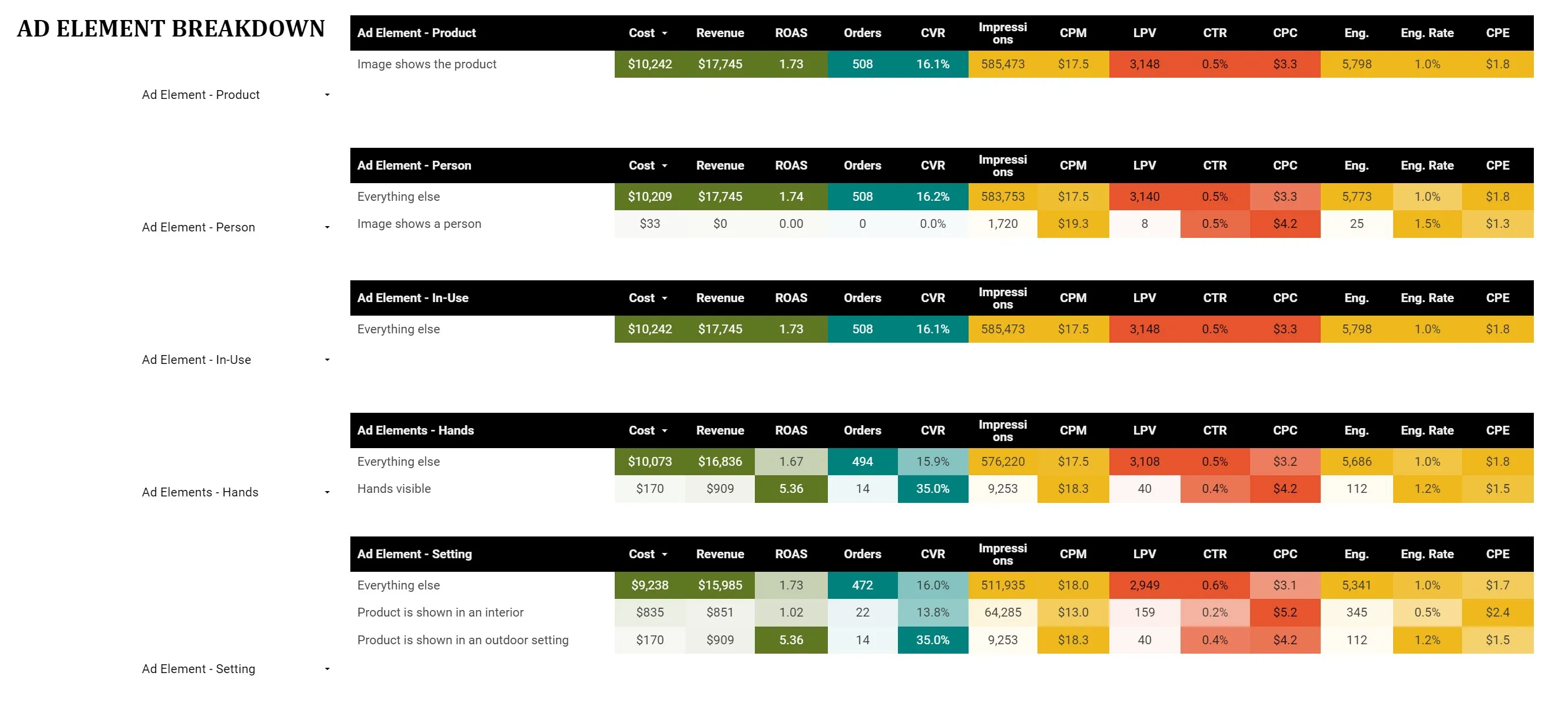
Calculated Fields Provide Much Greater Analytics
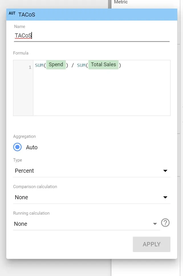
Calculated fields offer a huge advantage to your data analytics. Using a calculated field, you can combine two or more data sources or a data studio input field with a calculation to output new data. This new data could be the difference between two numbers or the percentage of a total.
What Is a Calculated Field?
A calculated field is a metric that is based on one or more data sources. This new calculated metric can be used in charts, tables, and visualizations to provide a better way to evaluate your data at-a-glance. Many people also refer to these as Google Data Studio Custom Fields.
You can select the data sources, which will be two or more existing fields, and then apply a formula to them. The output from the formula will be the value in your new calculated field.
What can you do with calculated fields
Here are some calculated fields example uses:
CONCAT - join text fields in Google Data Studio with the CONCAT function to concatenate multiple dimensions.
REGEX_EXTRACT - Common use cases for REGEX_EXTRACT include the extraction of query parameter values stored in your ‘page' dimension. This function takes one input dimension and a regular expression as inputs, and it returns a text value.
UPPER / LOWER - If you find yourself having to sum data by a specific field and struggle with mixed upper- and lowercase spellings, the Data Studio function UPPER / LOWER can help. It takes one dimension as input and converts it into its uppercase or lowercase equivalent.
What about use cases
Here are some simple ideas for how to use calculated fields:
Custom Conversion Rate–A metric that is standard in data sources like Google Analytics and Google Ads, conversion rate does not always provide the required insights. To solve this problem, it is crucial to look for alternatives such as bounce rate.
Funnel Drop-Off Rate–Imagine that you want to know what causes customers to abandon a checkout funnel. Google Analytics goal funnels can provide some insight, but they only work if all your funnel stages equal a pageview. Instead, you can use calculated fields to show the drop-off rate for each individual stage.
Custom Content Grouping with the function of “CASE WHEN”–One of the practical ways of using Calculated fields is the Custom Channel Grouping or Custom content grouping, but could be used for events grouping or many more things.
Interactive filters the user control over data visualizations
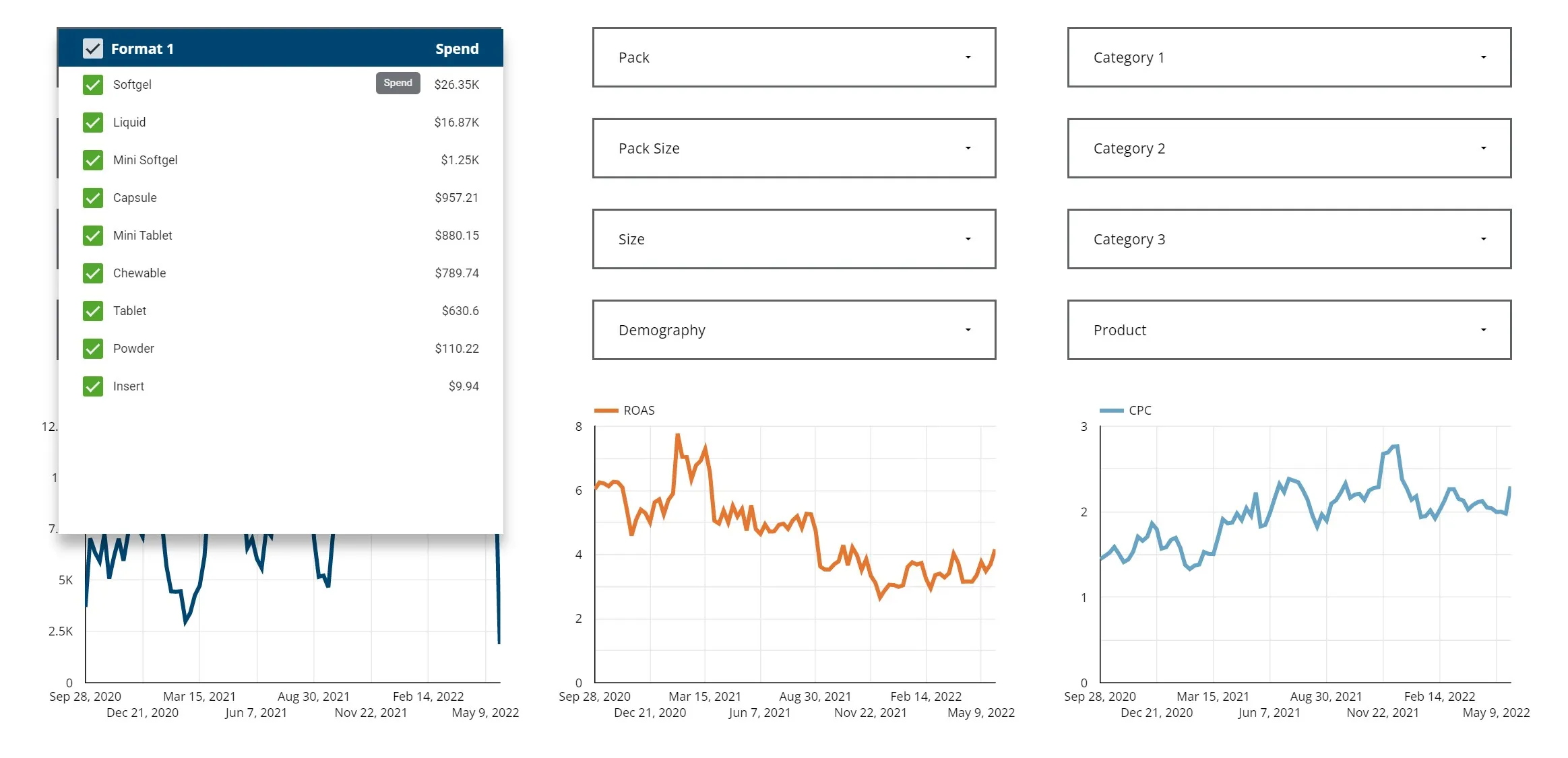
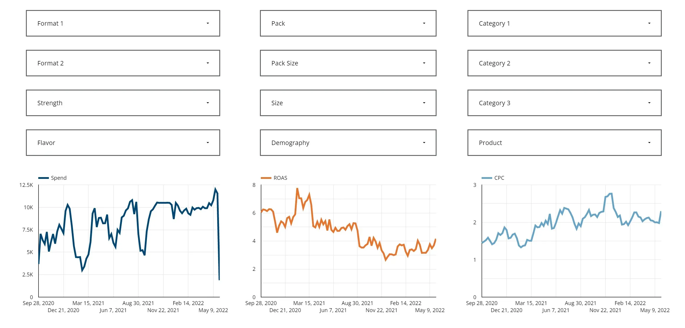
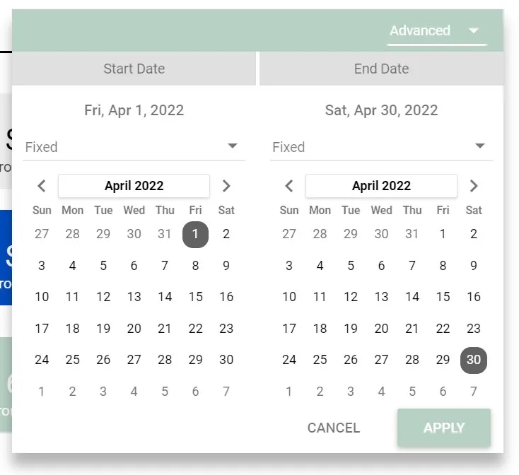
You can help users, either your teammates or customers, gain more insights by adding interactive filters. These tools allow for the use of different criteria to filter reports. You can create interactive filters that are editable or fixed.
A variety of data can be brought to the surface using filters. A simple example is an easy date range filter. This could be used to show data for the last two weeks instead of for the past year.
Other query parameters, such as platform, ad groups, or search terms, could all be used to filter a data source to return specific, relevant information.
Create Custom Reports to Improve Data Visualization
Which data is the most valuable for your customer? Which metrics are the most important for your team? These questions show you why custom reports are so valuable.
Simply putting the right chart in front of the right person at the right moment might enable the best business decision.
Your clients want to know your strategy is working for them. Thorough analytics and clear reports will hold the interest of your client and help them see the value in what you're doing.
Your company and teammates also need solid data visualization. Clear reporting reveals when results are good or when some more tweaking and changes are needed.
The key advantage of visualization is speed. People can take information from a visual source, such as a chart, much faster than reading through a table. You can use a Google Data Studio report to keep everyone on course to get the results you need.
Use Google Data Studio to Follow Key Performance Indicators
Delivering on Key Performance Indicators (KPI) are what drives marketers to success. If your client is spending resources on efforts that do not move the needle, then they will eventually stop paying you. GDS gives you clear ways to evaluate your KPIs and present that success to your client.
Optimum Click uses Google Data Studio to help our customers see the value in our services. Every client receives a customized data studio report and live dashboard that is available 24/7. If you’d like to know more about data-driven marketing and how it can help your business, please Contact Us .
Claim Your Free Audit to Uncover Hidden Opportunities
FAQ
Share this article!
Author of the article

MIKI Molnár
Senior PPC & Amazon Marketing Services Expert
Author of the article
Really hooked on data and insights……like… really hooked, Miki is also big on new thinking. “Tactics to give my clients an advantage”.
With a background in engineering and marketing his data-driven approach to PPC and especially Amazon's advertising platform gives Miki a laser guided focus on delivering (and over delivering) on client business goals.
10 years in social advertising
8 years in SEM
7 years in data visualisation
16 years of building brand
5 years in Amazon advertising